Showing posts with label art. Show all posts

Sunday, July 24, 2022

Wolfwalkers

 Wolfwalkers is an animated film from the same director as The Secret of Kells. It has a similar sort of art and line style, with movements easily flowing across the screen in a way I found very aesthetically pleasing. You can read the plot summary on Wikipedia, so I'll just give some viewing notes:

If possible, you should view this on a bedsheet in a neighbor's backyard.

Cover your delicious blood with skin, and cover that with clothing, then bugspray. (You will still be bitten on the face, and hands, and through your socks. This is the destiny of the delicious. Your itchy discomfort will be offset by the bug-free experience of neighbor kids.)

At the appropriate time --- and trust me, you will know the appropriate time --- you should absolutely howl along with the onscreen wolves. Everyone else, on their lawn chairs and picnic blankets, will absolutely do this, especially if < 7 years old.

Five stars, highly recommended. Not entirely historically-accurate.


This post's theme word is eidolon (n), "an idealized form" or "a phantom". The animation smoothly showed transition between physical humans, eidolon scents and spirits, and wolves.

Thursday, September 24, 2020

Every Place I Cry

Every Place I Cry was an improvised emo concert, whose direct-to-me marketing absolutely worked because I love Jess McKenna and Zach Reino (of the terrific Off Book: The Improvised Musical Podcast -- watch e.g. this live performance of "We Object to Fear").

It was great! I've appreciated the artists who have managed to set up the tech and broadcast live performances from social-distance-ville; it has broadened the variety of art available to me here in my house (and even in my city).

There were lots of little nods to the emo genre, familiar from middle and high school and possibly not even accessible to anyone of a different age or background, but... just... so... completely... delightful! to me. And kudos to them for their many consistent character choices (including emo artist names on each performer's Zoom byline), set dressing (crows! perched on everything! terrible shirts and hair!), and on-stage banter as if in an in-person venue, including ending the night with "thank you"s and "Be safe on your way back... to the other rooms of your house."


This post's theme word is heteroclite (n), "a person who is unconventional; a word that is unconventionally formed." Inventing an emo band is stereotyping heteroclites: curiously contradictory, but verbally delightful.

Thursday, August 20, 2020

Live theatre, sort of

WHEREAS the ongoing pandemic and various other elements of environmental, social, political, economic, and biological disaster loom large, and

WHEREAS the rational fairly strict self-quarantine (of those who are able) has, since March, severely limited occasions to socialize and gather in groups for the purposes of mutually enjoying culture and company, it is

HEREBY ACKNOWLEDGED that having so many performers shift to an online method for displaying their art to a geographically disparate crowd has, in fact, WIDENED this reader's ability to financially support the artists she loves while appreciating their performances in real-time.


Everything's on a screen, and frankly having to see my family only in delineated, buffered, pixelated windows feels much more limiting than having to see live performers in windows. Realistically these performers would have been mostly inaccessible because they were not touring my locality; so I find a tiny sliver of redemption for 2020 in the broader access to live art. The rest of 2020 should consider itself still on blast for its shortcomings.


This post's theme word is rort (n), "a wild party." I have tickets to watch shows three nights this week, from the comfortable pajama-clad rort of my own sofa!

Saturday, April 6, 2019

Peter and the Wolf

Swarthmore College Lab Orchestra's presentation of Sergei Prokofiev's Peter and the Wolf was delightful --- playful, cute, fun, and with an auditorium full of children who shrieked at the scary parts. Like many others in the audience, I brought my parents, and we all had an enriching time. I particularly appreciated that we were invited onstage after the performance to chat with the musicians and look at their instruments up-close.

We later in the afternoon remembered that the iconic wolf music was the "bully" theme music from A Christmas Story.


This post's theme word is exclosure (n), "a fenced area, especially in a wide open area, to keep unwanted animals out." The wolf was captured outside the exclosure!

Thursday, January 18, 2018

everyone's a aliebn when ur a aliebn too

everyone's a aliebn when ur a aliebn too is a graphic novel by Jonathan Sun. It details the expedition of the main character, an alien sent to Earth to document the habits and peculiarities of humans. The titular alien is unusual, a bit of an outcast even among aliens, and so its expedition to Earth is full of self-doubt and self-reflection.

The book is cute and a very quick read (most pages contain only one or two sentences, with illustrations). It feels calm, simple, and reassuring, and has a strong undercurrent that gives me the sense it is aimed at adults who think about mental health and self-care a lot. It touches on issues of identity, loneliness, death, love, belonging, purpose, and friendship. Also there is one bouncy castle.

I wasn't in the right mood for it, but I'd recommend it anyway. (I was in turn recommended it by Tracy Clayton of the podcast Another Round.)


This post's theme word is verklempt (n), "overcome with emotion; choked up." The aliebn [sic] made many friends and made the reader verklempt throughout its wanderings and musings.

Thursday, March 9, 2017

Musée de Cluny

The Musée de Cluny (alternately, the Musée national du Moyen Âge; wiki) is a lovely museum in the center of Paris, focusing on the middle ages and on the grounds of a Roman bath/abbey/garden. I enjoy museums and I enjoyed traversing this one on hard mode, with no personal concessions to English-translated guides or material.

Some of the illustrations seemed downright whimsical and modern in their styling, for example this image from a combat guide:
"Traité de combat" from "Tradition de maître Johann Lichtenauer, Augsburg, 1490-1500"

The museum ticket was printed with one of several randomly-selected works in the museum, providing a solo scavenger hunt. My ticket was a piece of the unicorn tapestries, although no unicorn bits made it into the clipped ticket frame.
Foreground: ticket. Background: original tapestry.

For part of my visit, I was delighted to be stuck a few meters behind a group of elementary-aged schoolchildren getting a guided educational visit. I learned some easter eggs to look for in stained-glass windows (one guy is winking! look, the camel is sticking out its tongue!) and also got to practice my "guess what that specialty historical word is" linguistic skills. Luckily the guide was excellent and provided simple-words explanations for everything. I tried to stay in earshot but not interfere with the herd.

Eventually the school group diverged and I continued my exhaustive, read-every-plaque grown-up museum visit. I spent a long time in this completely emptied and desacralized chapel, which was used as a dissection room (with observing medical students!), among many things, throughout the years.
This panorama does not really capture how mind-bendingly awesome the room is. But it tries.
 The stonework is really superb, gently curving in really precise geometric formations, with insets of different stonework curves. All completely symmetrical, at least from the floor and to the human eye. I'm curious what tools/templates/techniques were used to construct this, but of course for that we'd have to go over to my favorite Paris museum, the Musée des arts et métiers (wiki).
The stonework, carved vines and leaves and grapes and branches, even includes a scattering of snails, creeping their way along. I lingered in this room looking to find every single one (I'm sure I missed some).


This post's theme word is pleniloquence (n), "excessive talking." A solo visit to the museum is leisurely and absent any pleniloquence.

Monday, January 2, 2017

The Barnes Foundation

The Barnes Foundation is a lovely modern building --- designed to conserve a certain claustrophobia from an older building --- housing an enormous collection of Renoir paintings, iron door hinges, and a smattering of other artworks, farm implements, and historical furniture.

Wandering through it is overwhelming. There is such a profusion of art, so closely mounted and tiling the walls, that viewing and appreciating each piece individually would take much longer than is feasible without dying of dehydration. (Or being shuffled out of the museum at closing time, which has happened to me.)

It is just possible to be struck with certain artworks, in the time available. Photos are not permitted, but I can perhaps source and link to some of my favorites. (Yes, of course I took notes.)

The watercolors of Demuth's "Bicycle Acrobats" suggest a kind of airy defiance of gravity. I thought this was very impressive technically, since I associate watercolors with clouds, ponds, indistinct flora --- and this piece has motion, with definite lines and boundaries.
Demuth's Bicycle Acrobats
I reliably found that art I admired from a distance turned out to be by Glackens. His lines, his colors, his ocean scenes; I'm not sure what did it exactly, but I liked a lot of art which (upon reference to the tiny labels or the art-key-pamphlet) turned out to be Glackens'.
Glackens "Woman Walking"
Glackens "Beach at Dieppe"
Glackens "The Bathing Hour, Chester, Nova Scotia"
I think maybe it's his palette of blue oil paints. They're very appealing.

I also quite enjoyed Klee's work, which was less representational but still imbued with a colorful fun.
Klee's "Village Among Rocks (Ort in Felsen)"
And finally, reprising my visual enjoyment of blue, and boats, and water, we have Signac.
Signac's "La Rochelle"
(Signac and Seurat are both excellent. I liked all the pointillism on display as it foreshadows --- in my ongoing mental narrative --- the rise of pixels, while contrasting sharply the number of man-hours required to produce the work.)

I was also quite intrigued by a number of the iron implements (tongs/scissors/andirons/rakes/shovels/hinges/hinges/hinges/hinges) adorning the walls, but no particular one stood out and you really should visit them in person for the full door-hinge experience. No terse cultural correspondent can possibly summarize such an event.


This post's theme word is hendiadys (n), "a figure of speech in which two words joined by a conjunction are used to convey a single idea instead of using a word and its modifier. For example, "pleasant and warm" instead of "pleasantly warm"." The suitable hendiadys for the Barnes Foundation is that it is interesting and full.

Sunday, December 18, 2016

Philadelphia Museum of Art

The Philadelphia Museum of Art is large, interesting, and fronted by an extremely imposing set of steps and vista.

I quite enjoyed one of Picasso's paintings entitled "Female Nude", which absent the title I might have guessed was "collection of brown and off-brown rectangles in a stack". This sort of extreme distortion of a representation is very appealing; partly for the puzzle (can you find the female nude in there?) and partly for the aesthetic joy of stacked rectangles.

Frits Thaulow's "Water Mill" is incredible:
... as in, I do not credit my eyes. The painting is playing some incredible brain-perception trick, in that the water reflection looks photoreal in the center, yet just off-center it is clearly impressionist, with fine details merely suggested by broad brushstrokes. And the water mill building itself at the top of the painting is a low-polygon-count-style backdrop, reminiscent of a video game level. (I'm thinking of Braid in particular, but maybe Braid was just done in a style reminiscent of Thaulow's "Water Mill"?) By brain reads the whole thing as a photograph, but when I closely examined any detail (in person these are much more easily perceived than in this photo of the painting), I could clearly see that this was the result of paint applied to canvas. Mystifying. Cool.

This is also one of the unusual paintings of water in which the water is not predominantly blue, but still looks obviously like water.


This post's theme word is mazarine (adj), "a deep, rich shade of blue." The churning bubbles lightened the mazarine of the depths into a foamy whiteness in the shallows around the mill.

Saturday, July 16, 2016

Arts et Métiers

I'll probably never stop singing the praises of this museum, it is delightful and its subway stop is decorated to match.
Oh, the riveted faux-brass panels were not enough of a clue?
The entire thing gives the steampunkiest impression, and it is heightened by the fact that all the M11 trains that pass through the station carry the smell of burning sawdust. Mental associations to workshops, handmade items to solve technical problems.
Apparently I always take a photo from this exact location.

To go with the everything-is-gears theme today, I bring you this: a thrilling printing press, I believe in several colors, on display in the museum.
If ever I possess property, space, and money to spare (any eligible landed bachelors out there?), this will get a high priority. Although of course it comes after my Jacquard loom, which I'll be building from first principles (until it becomes ridiculous, then I'll look up historical examples).


This post's theme word is agglutinate, "(verb tr., intr.) to form words by combining words or word elements; to join or become joined as if by glue; to clump or cause to clump, as red blood cells" or "(adj.) joined or tending to join; relating to a language that makes complex words by joining words or word elements extensively. For example as in Turkish." What agglutinated monstrosities, what delightful conglomerations of gears and mechanisms you have!

Thursday, May 26, 2016

A fair prospect from La Defense

While in a post-exercise fugue state of relaxation, I wandered into this dystopian-movie-style skyscraper vista. All very clean, and complemented by the luminous sky.
For those unfamiliar with the local skyline, that rectangular arch is La Defense, a business district outside of Paris.

In the Paris-ward direction, there is a reflecting pool with a sculpture installation of what look like giant children's toys, each ornamented with a blinking light. All the lights shift colors in a coordinated pattern, but slightly out-of-sync with each other.
 

The photos don't capture it properly. What appears as a uniform grey-blueness across the pictures was actually pretty calming and visually interesting.


This post's theme word is polysemous, "having many meanings." The sculpture is surely polysemous.

Monday, April 11, 2016

Sonic screwdriver science

I was surprised to see this giant bronze woman holding a sonic screwdriver, wielding it quite fiercely at a (bronze) parchment in front of the Hôtel de Ville.
From this angle, it really really looks like a sonic screwdriver. I just couldn't come up with anything else it could be. The seated, naked, generic statue lady didn't have a lot of context clues. The Wikipedia page was not a huge amount of help, since the building is coated in statues.

On further examination from another angle, she is wielding a compass and considering some... academic thing... on that parchment. Her partner statue was wielding a pen on paper, which gives enough of a clue to sift through the photos and uncover that she is La Science, science embodied.
My high school draw-this-with-a-compass puzzle-solving practice might pay off when I take up modeling.
I'm glad to see that, at least in science-abstraction statuary, the gender imbalance is working in my favor.


This post's theme word is armsceye (or armseye), "an opening in a garment for attaching a sleeve." Science is not bothered by petty details of armsceye; she has long since transcended clothing altogether.

Tuesday, March 22, 2016

Iolanta / The Nutcracker

The Palace Garnier is a beautiful building, ornate and baroque and frankly luscious inside. (See previous shots of the lobby.) The performance hall is just as sumptuous, with tiers of box-lined balconies and everything done in red velvet and gold.
The boxes look nice, and as you can see, they serve as wonderful vantage points for looking at the other boxes. The stage? Not so much.
The neighbor-box dividing wall --- lined in red and buffering me from the lower classes who were presumably permitted into the lesser boxes --- blocks one corner of the stage. The overhanging lip of the next tier blocks the upper third of the area, including the opera titles. Not pictured here, but the people sitting in front of me, as they variously shift and lean to try to see the stage, blocked even more.

So the visual part of the spectacle was difficult.

Luckily, the Opéra Garnier production of Tchaikovsky's Iolanta used only an inset, centered portion of the stage. I read the synopsis beforehand, so the omission of the opera titles (and my weakness in Russian) did not impede my enjoyment of the music and singing. It was lovely, one completely standard and satisfactory unit of opera enjoyment. So of course I have almost nothing to say about it, and lots to say about the rest of the evening.

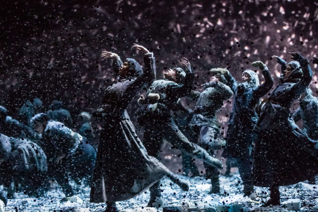
Following the opera, the ballet performed The Nutcracker, in a non-Christmas-themed staging that I wasn't able to cohere into a single plot. The various scenes were only loosely connected, via interesting stagecraft. The single-room set in which Iolanta took place drew back and slotted into a larger set which filled the stage, where The Nutcracker began as a 1920s-themed children's birthday party. (Of note: Iolanta had a Christmas tree onstage, which was removed for The Nutcracker, in some kind of reverse-Chekov's-gun/red herring ploy.) This included a very cool game of improvised freeze-tag synchronized with the music. Ballet companies should play freeze tag in public more often, it is really fun to watch. This scene ended with a harsh exploding noise, and the building apparently (?) succumbed to an earthquake, with rubble (!) falling from everywhere and blanketing the stage. A transparent screen completely divided the stage from the theater, so no rubble or its considerable dust settled on the orchestra or audience. The pas de deux was staged as two survivors of this earthquake. (I think. A lot of it took place on the occluded side of the stage.) Then, in my favorite use of the screen-wall, giant fans gusted snow all across the stage to its full height, like a blizzard. Heavily wool-jacket-bundled ballet dancers did a kind of freezing coordinated squall dance that was interesting, and not really like other ballet I've seen. 
Ballet in a snowstorm.
Check out the gallery for more, and to get an idea of the variety of spectacle presented across the evening.


This post's theme word is furfuraceous, "covered in dandruff" or "flaky". I do not envy the scene-changers their furfuraceous task during the second intermission.

Wednesday, March 9, 2016

Extremely French

I was supposed to go to the opera to see Die Meistersinger von Nürnberg, a lengthy and high-cultural-value affair lasting 4.5 hours. It is an opera about master singers, and a comedy, so I was really looking forward to the auditory spectacle and the sheer delight. Very enlightened, very fancy, very grown-up and moved-to-Paris of me.

But.

There is a national strike today, over some new labor laws, which includes theater technicians. So the opera was cancelled because of a strike.

Even more French!


This post's theme word is inveigh, "to complain or protest with great hostility." The octogenarian-filled queue to exchange tickets at the opera was grumbly but did not inveigh.

Sunday, March 6, 2016

Video game art

An interesting and high-concept, fancy exhibit of video game art included swooping drops of tone down to doodles on the wall, including several featuring a very stupid rabbit (citation needed?) who goes on adventures, often of a fatal and pratfall-humor nature.

The squids, tentacly, badly lit in this awkward photo, and in a spaceship, were a favorite with me.

This post's theme word is quisling, "a traitor, especially one who aids an invading enemy." Is there any other kind?

Tuesday, March 1, 2016

Il trovatore

Verdi's Il trovatore is a... an opera. I wanted to write something like "a jolly operatic jaunt into the stereotyped gender-roles of yestercentury" but I don't think that my sarcastic tone carries through sufficiently. So I'll save "jolly" to describe operas which are nonironically jolly, pleasant romances and cross-dressing comedies.

This one is not that.

The music is gorgeous. The performers were excellent. (Several enthusiastic audience members audibly cried, "Bravo! Bravo!" after particularly emotive arias.) The staging was abstract and stark, which is not my favorite type of visual spectacle. The stage was a bare grey-brown rectangle, out of which a grid of vertical rectangular slabs could be lifted to various heights, surrounded on three sides by giant mirrors. The slabs were used to build the cells in a prison, or suggest a graveyard, or as military foxholes. It was a creative use of monochromatic 3D rectangles to portray a variety of settings. (See the slideshow here.) The costumes were mostly also a drab grey-brown, all military fatigues and gypsies wearing rags and dark overcoats. The blocking was rectangular and fixed, too, although this could just have been suggested and accentuated by the stage decorations. (My preference tends more towards staging, choreography, costumes, and sets which could be described as "lush", or "ornate", or magnificently "rococo.")

I loved the music.

I detested the plot. Its overarching theme, reinforced with every scene and sometimes every line in a scene, was that women are property, to be owned, punished, and exchanged by men. Booooo. It's a historical attitude, sure, and modern performances are literally restricted by the limits of the libretto. But still. Even within the plot, the female lead Leonora tries to use socially-acceptable techniques to control her fate (although not to own herself, never to own herself, remember: women are property, she can at most influence which man owns her). She tries to take vows at a nunnery and is interrupted by not one but two men (that cursed love triangle) who come to repossess her.

Lots of other plot crap happens. Read the synopsis if you like; it contains details that are so subtle that they are not even mentioned aloud during the opera, and YMMV based on the starkness and detail-paucity of your particular production. This is one of those plots where if all the characters could just sit down (unarmed) around a table and talk for 5 minutes (or maybe 45 if they're singing instead), the entire plot could be resolved, with no dramatic irony or tension or really much of a hassle at all.

Instead, everyone dies. (Well, almost everyone.)

There, I've spoiled it for you, as much as a 150-year-old opera which follows all the opera stereotypes can be spoiled. (Perhaps I've spoiled all operas for you: everyone dies at the end! Voilà!)


This post's theme word is makebate, "one who incites quarrels." Based on historical data, librettists tend to be inflammatory makebates: consider at how many duels, wars, fights, and poisonings they incite.

Saturday, February 6, 2016

Rodin museum

The weather today was clear and cool, an invitation to emotionally open up, to start anticipating spring, to remember that not all shirts have long sleeves. I went to the Rodin Museum, which was plentifully supplied with gorgeous midafternoon light in its luxurious windows.
Behold: the real estate mere mortals will never inhabit.
It was beautiful. The art was pretty nice, too.


This post's theme word is septentrional, "northern." The septentrional prospect from Rodin's house is less impressive, as the gardins lie to the south.

Saturday, January 23, 2016

Bizarre expressionless mannequins

Paris storefront windows put up special Christmas-themed displays. Lots of what you expect: snow, pine trees, something cartoonish or childish.

But this one.

This one, I cannot fathom.
Are the women greeting the new year?
Why are they dressed only in giant bows and party hats? Why are their limbs strangely elongated and distorted? Is this social commentary on the unrealism of mannequins, or on the way women must present themselves, bundled, primped, and covered in sparkles, to be glamorous in our society?
Your interpretations welcome in the comments below.


This post's theme word is hiemal, "of or relating to winter." Behold, the inscrutable hiemal display!

Musée d'Orsay en fête

I saw a concert at the Musée d'Orsay last night as part of a weekend-long celebration. The music was a nice selection --- all in French, even the librettos usually performed in Italian --- and the frission of being in the museum after hours, of nestling in amongst the statuary to listen to music, was very pleasant. The acoustics fulfilled exactly the expectations of a refitted train station; the soaring ceiling, so open to light and space for visually-experienced art, simply sucked up a lot of the sound. What sound remained was bounced around in off-beat echoes. Also, some of the stage lights were pointed directly at the crowd, I guess so that the glare-induced headaches would distract from the echoing cavern.

An interesting experience.

An unconventional use atop an unconventional use of a train station.
HT: R, who found this event, suggested attendance, and accompanied me. We had fun.


This post's theme word is lyceum, "a lecture hall or an institution that provides public lectures, discussions, concerts, etc." Each lyceum has its own acoustic profile, suitable to certain activities above others.

Wednesday, January 6, 2016

Alien husks

The ways in which the inhuman and transitory artificial environments of airports are decorated always suggest strange alien decision-making processes. What effect is the art supposed to have? To hold passengers' attention while they wait? To brighten their days? To give them something to contemplate other than the unusual fluid dynamics upon which heavier-than-air flight relies?

Mimi Bardagjy's sculptures call to mind alien husks, the discarded shells of deep-sea creatures, or abandoned multi-creature egg casings. They are lit in a clinical way that makes them seem creepy.
Close examination shows (and the description confirms) that the ridges and indentations are human-finger sized, so that the entire thing is like a tube of putty gripped in an impossibly-many-fingered fist.

They are creepy and delightful.


This post's theme word is calyculus, "a cup-shaped structure." Behold these discarded ceramic calyculuses!

Monday, December 28, 2015

Traced against the sky

No matter where we walked in [the touristy part of] San Antonio, an orange squiggle followed us, always just catching the corner of the eye. It is La Antorcha de la Amistad,and it makes me think of a 3D-printed puzzle or unusual key. Maybe to a geometer's lair?
The color gradients across the sky and the sculpture were very appealing to me.
I'm not sure how the lock would work, exactly --- maybe you put the key in, turn slightly, move again in the z axis, turn again, then shimmy in a move given by a simple equation in polar coordinates?

Maybe it's the extrusion of some more complicated being into our space, and the intruder is trying to be polite and not move in the hopes that no one will notice.


This post's theme word is bidentate, "having two teeth or toothlike parts." Thank goodness the tentacle was only bidentate.